Well, it’s been a little while since I last did one of these quiz format blog posts and neither of them has given anyone cause to fire me, so I guess it’s time to ramp up the silliness again. You know the drill (and for some my sense of humor might be as enjoyable as an accident with a power drill): I put some scenarios in front of you and you hazard a guess (or informed decision) about whether it constitutes a WCAG failure. For this one we’re looking at images, specifically the use of images that contain text. When do they fail SC 1.4.5 Images of Text? We’re about to find out!
As before, a quick check to see if you want to go all in on the quiz format:
All the Dubiously Named Tests
- Button up, buttercup
- Can’t beat the system? Go with the flow
- Refer to the specs
- The writing’s on the wall
- Steamy windows
- You could get Fyred for this
- Table genius
- Logo No-Go?
Button up, buttercup
Let’s start with something nice and easy – some buttons! Look at them. Aren’t they gorgeous? No? Are you casting aspersions about my ‘Design Skillz’? I fear you might be. So, let’s pretend that these actually look half decent but each one is still, essentially, a button with text.
If this were implemented as a <button> with an <img> inside, would you fail this for 1.4.5 Images of Text?
<button><img src="button-apply-now.png" alt="apply now"></button>
<button><img src="button-click-me.png" alt="click me"></button>
<button><img src="button-do-the-thing.png" alt="do the thing"></button>
Does this pass or fail SC 1.4.5 Images of Text?
- There’s really nothing complicated here – these are simple text-based call-to-action buttons and have no business being implemented as images.
- There is nothing style-wise that cannot be achieved with good, old-fashioned CSS. How can I be so sure? Well, I created the buttons with HTML and CSS and then took screenshots. If I can make ugly buttons like this without firing up Photoshop/Figma, anyone can (but maybe don’t go for ‘ugly’).
Can’t beat the system? Go with the flow
With this image we have a … you know what? I have no idea what this is all about. Something to do with aquatic organisms and how they relate to each other. Lots of directional arrows, numbers and species names. It probably means something to a marine biologist, but to me? Pffff!
What this represents is maybe not important, though. What we can be sure of is that there is a lot of text in this image. So, should it be real (HTML) text instead of an image?
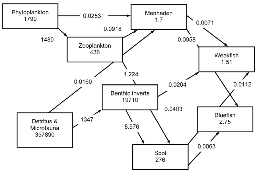
Does this pass or fail SC 1.4.5 Images of Text?
- While there is a lot of text here, the positioning of each element and the positioning of the various annotations against the relationship lines are critical to the understanding of this.
- Theoretically, you could implement this with HTML and CSS but the chances are that it will break far too easily for all manner of reasons (window resizing, font size adjustment, text spacing).
- An
<img>element would be fine here … but I would humbly suggest that a more appropriate route would be to provide this as an SVG so that when it’s scaled up (SCALED! A sea creature pun! Sorry …) the text remains pin sharp. - One important point to mention with this image – its complexity in the layout also means that it’s going to be challenging to describe in a text alternative. Too much for just an
altoraria-label. You might consider placing a thorough description under the image inside a collapsed disclosure (or a humble<details>/<summary>).
Refer to the specs
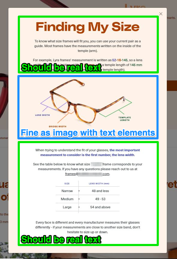
Excuse me while I reach for my own specs as I try to read some of the small text on this image. And I should emphasise that this is all one image. One dirty great big image presented in a dialog. So, given this information, what say you to this being a 1.4.5 failure?
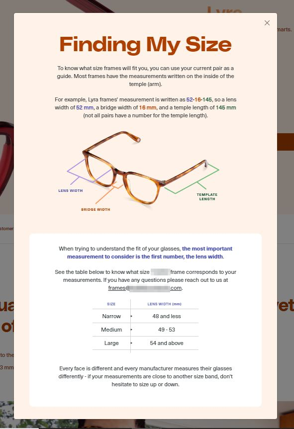
Does this pass or fail SC 1.4.5 Images of Text?
- There is a whole lot of text here and pretty much all of it could easily be styled with a sprinkle of CSS.
- There’s also a table in here which, because of it being an image, cannot expose its structural relationship (so it also chalks up a SC 1.3.1 Info and Relationships failure.
- BUT … there is a portion of this where I would not fail it for 1.4.5 – the part where the glasses have annotations which could potentially get disassociated/broken for the same reasons stated for the aquatic organisms image.
- The top and bottom parts of this should be HTML text (and a table), with just the middle section being an image, as shown below:
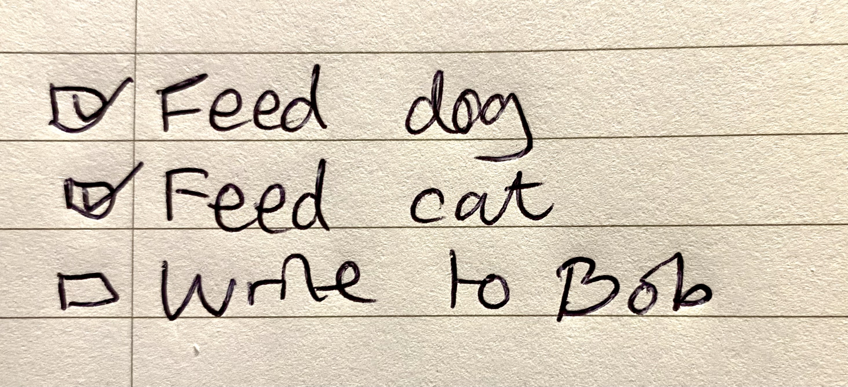
The writing’s on the wall
Well, that’s a lie. Clearly this is just a piece of paper, not a wall in sight. It’s a scruffily written TO-DO list with, let’s be honest, some not particularly challenging tasks. But let’s just remind ourselves of our immediate task at hand: making sure we know when to fail images of text. Time for another checklist …
- Check It’s an image
- Check It’s got text in (and almost only text)
So, it’s a failure of 1.4.5 then, right?
Does this pass or fail SC 1.4.5 Images of Text?
- Time for another “it depends” scenario. What is the purpose of this image? If it were there to actually provide a to-do list, it’s not really doing its job as an image.
- But if the image is there to show off (or in my example, shame) the handwriting, it has to be an image. No handwriting font can convey all the unique attributes of a person’s handwriting.
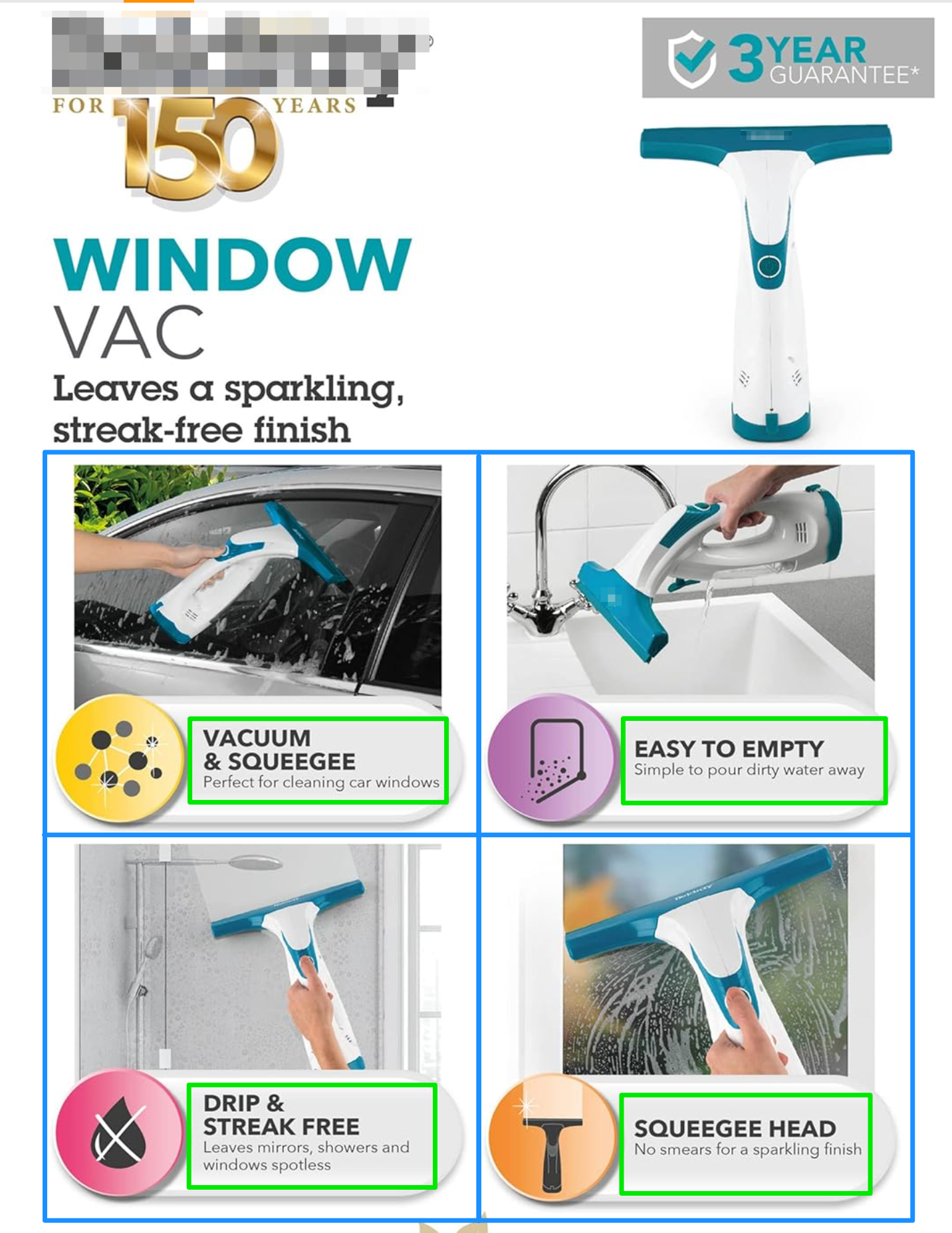
Steamy windows
What do we have here? Some advertising bumph for the features of a window vac. You see this kind of thing on many an ecommerce site, typically because the site doesn’t provide vendors using the site with any real way to do anything too creative. It’s probably a case of “You can upload some images … and that’s it!” so we end up with batches of images that can be, at times, text-heavy. Is this a pass or fail? Surely this one’s easy peasy, window squeegey?
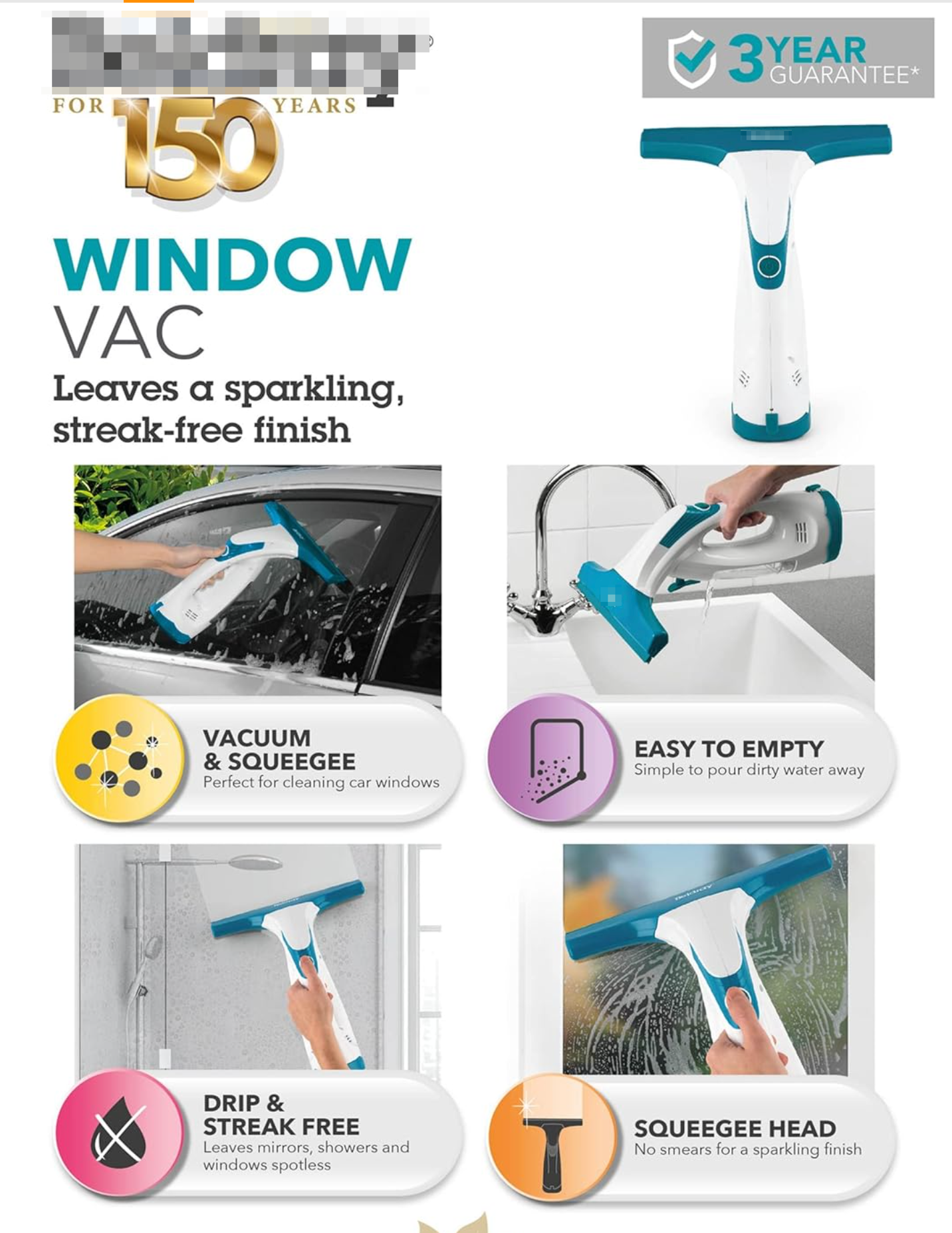
Does this pass or fail SC 1.4.5 Images of Text?
- I’m going to go with this one being a pass, but with caveats.
- I would expect that the minimal amount of text here is available as alternative text, but of course it would lack any sort of structure.
- BUT … if something like this were to feature on a client’s own site where it would seem that they do have the power to add a little structure then I might take a slightly more hard-line stance.
- Popping on my developers’ specs for a moment, I see this as a list with 4 items. Each list item has some very easy-to-style text which is positioned over a background image in a way that could easily withstand most users’ resizing or text spacing shenanigans.
- If I had a high level of confidence that this was something that the client had control over, and they had not taken this approach, then I’d be giving them a failure of 1.4.5.
You could get Fyred for this
A few years back, a certain trend started to emerge where celebrities would get around the 140 character limit on Twitter (as it was then) when they needed to provide a humble apology: they just vomited out their nonsense into their iOS Notes app and then took a screenshot (like the example below from Ja Rule about the awful Fyre Festival). Posted. Job done. Guilt absolved! But were they guilty of something else here? Hmmm ….
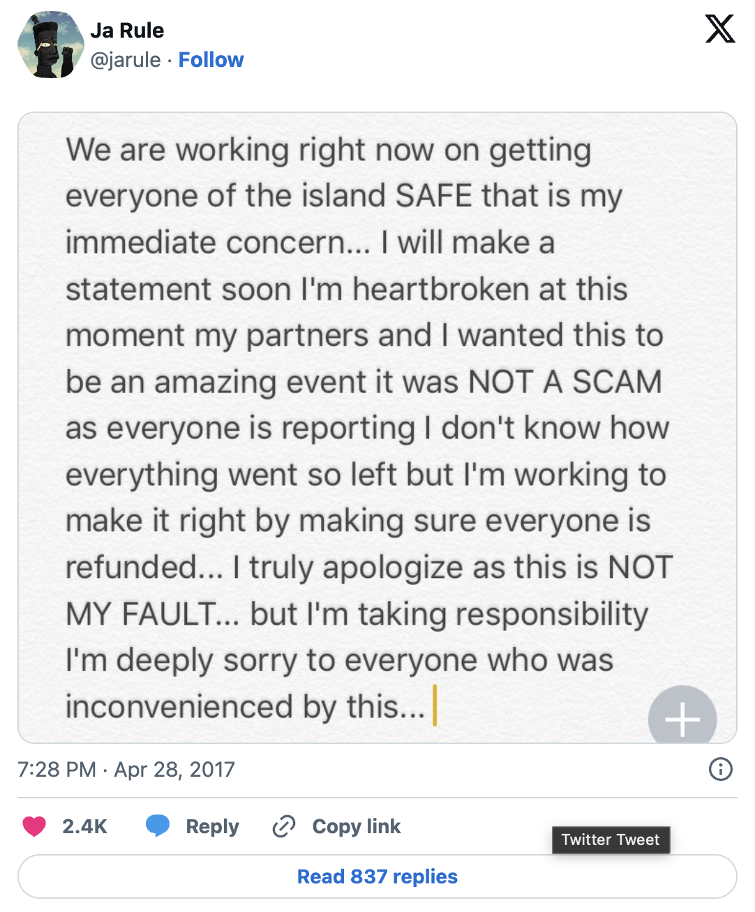
Does this pass or fail SC 1.4.5 Images of Text?
Dead easy, this one. It’s just text. Formatting is not important, the words are. This could have been tackled any number of ways other than ‘lazy screenshot’:
- It could have been broken up into several tweets in a thread.
- It could have been a shorter tweet that then links to a longer-form piece.
- Or maybe Ja Rule could have stayed well away from the whole event business to begin with. Dude had no idea what he was doing …
Table genius
Now, to be fair, it’s not very often that I come across table data that is implemented as an image. Oh no, the usual issue I find with tables is that they are marked up using an absolute rats nest of <div> elements, or similar, so that it looks like a table but sure doesn’t smell like one. But it does happen, usually on product description pages where (like the window vac example) the vendor has capability to add images to show off product features but little more.
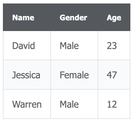
So, let’s ask the question then …
Does this pass or fail SC 1.4.5 Images of Text?
- Definite fail here. While it might be possible to summarise the data in the table with an
alt, anything more complicated than this mocked-up example is going to become unwieldy, quickly. - I wouldn’t just level a 1.4.5 failure here – there’s clearly a structure/relationship being presented visually that cannot be replicated in an equivalent fashion using alternative text, so this one also gets a SC 1.3.1 Info and Relationships failure. Let’s really put the boot in, eh?
Logo No-Go?
With logos, it’s almost always a simple answer – it’s a logo, therefore it’s exempt. From the Understanding doc (edited/summarised):
If the technologies being used can achieve the visual presentation, text is used to convey information rather than images of text except for the following: … Logotypes (text that is part of a logo or brand name) are considered essential.

Another easy one, then. I won’t even ask the question. I’ll just tell you: this passes 1.4.5 Images of Text. But we’re not quite done here!
It’s not uncommon to see a company logo that is then combined with some other text. Text that has (apparently) almost zero design guidance/input. It’s just … boring old text. And yet, the two elements together have been implemented as a single image. This kind of thing:

Now what do you think?
Does this pass or fail SC 1.4.5 Images of Text?
It starts to get a little subjective at this point. In my simplistic mock-up, I have tried to make it REALLY evident that this text underneath is about as unstyled as possible. I can’t recall what font I chose before creating these images, but I would put money on it that I chose ‘Verdana’.
There’s almost no reason for this to be expressed as an image, in my opinion. I would say that this needs to be split into two parts.
- An image for the logo (and let’s go with an SVG so that it scales without issues).
- Real text for the “We do important stuff”.
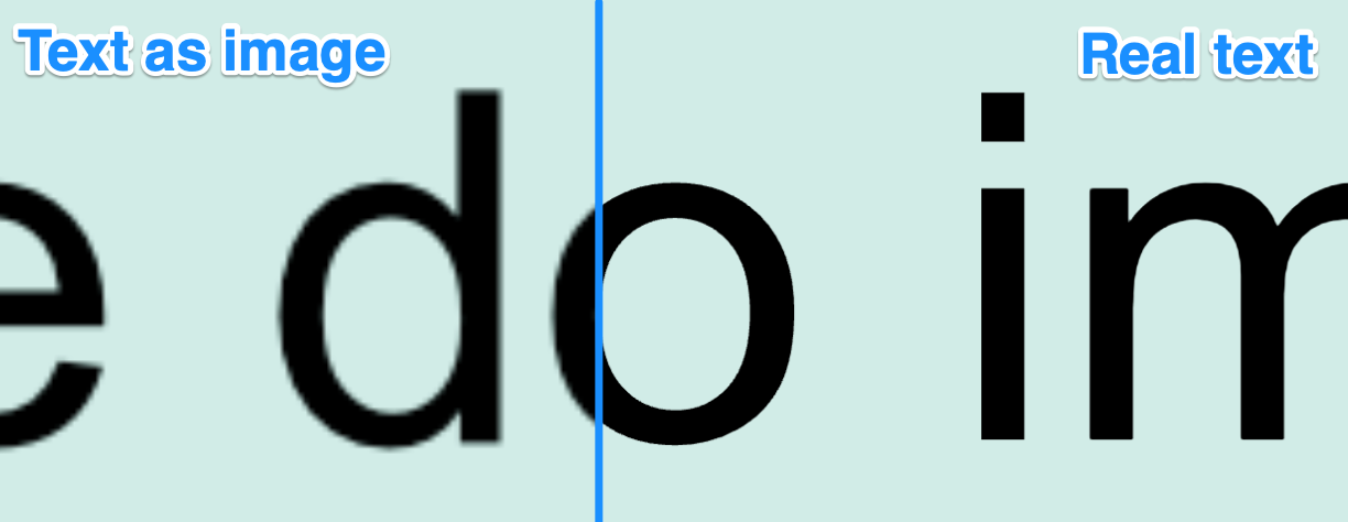
It’s worth reminding ourselves why this is better as real text—after all, this is the whole reason for SC 1.4.5 Images of Text—as we compare the real text zoomed up compared to the bitmap image version:
So, had this been split into two separate elements, with the text below set as real text, not an image, we’d be giving this a pass for 1.4.5.
I am aware that this is subjective … and what an accessibility expert might think is a ‘boring, standard font’ might have designers going into an absolute outrage over the lack of understanding of the artistry that went into the kerning, position, choice etc. Personally, I’d raise it as an issue and wait for that push-back to happen (because it might not, you never know).
We’re all done here—how did you do?
The use of images of text has, I would suggest, become less of an issue over time as the power of CSS to style and position text elements has gained ever more power. But it’s still something that we run into from time-to-time. There are some examples where you might be able to make the case that a skilled HTML/CSS person could recreate what is presented in an image pretty much perfectly. But you must also ask the question about how this might put the visual layout at risk once we’ve factored in the extra flexibility of font size changes, text spacing and so on. While this is all well and good, such changes can potentially break what is an important layout. Wherever you can, push for real text. And wherever that may not be possible, at the very least push for an SVG over a bitmap image.