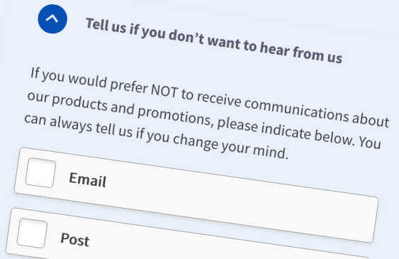
 “Unethical”, “misleading” and “exploitative” are the words used by the Norwegian Consumer Council to describe the use of dark patterns and privacy-intrusive default settings by Facebook, Google and Microsoft. The council’s report, titled Deceived by Design (PDF, 3.2MB), documents the “deceptive” and “manipulative” techniques that companies use to nudge users towards disclosing as much information as possible.
Yet despite protestations and renewed commitments to data privacy from the companies named in the report, nefarious design practices are unlikely to go away. Dark patterns (at least in the short term) are simply too profitable. The truth is: many companies care little about how anxious or stressed their websites make you feel. In fact, companies may well be counting on your being anxious.
But that’s not to say that there’s nothing we can do.
In my previous post, I talked with several people with anxiety and panic disorders about aspects of user interface (UI) and user experience (UX) design that contribute to feelings of anxiety and panic. In this next post in the series, I offer some practical guidance on how to improve accessibility for people with anxiety and panic disorders.
Designing for anxiety

Recent efforts by the Web Accessibility Initiative’s Cognitive and Learning Disabilities Accessibility Task Force aim to address this research gap to better support users with stress, anxiety and depression. In his recent Inclusive Design 24 talk—Addressing Trauma- and Stressor-Related Disorders—Thaddeus Cambron describes how he hopes to bring additional visibility to anxiety and trauma disorders through his position on the World Wide Web Consortium’s Personalization Accessibility Task Force.
But despite not explicitly mentioning anxiety and panic disorders, the Web Content Accessibility Guidelines (WCAG) 2.1 still include a number of success criteria that can help people with these disabilities. Similarly, a number of TPGi’s Inclusive Design Principles are relevant to people with anxiety and panic disorders.
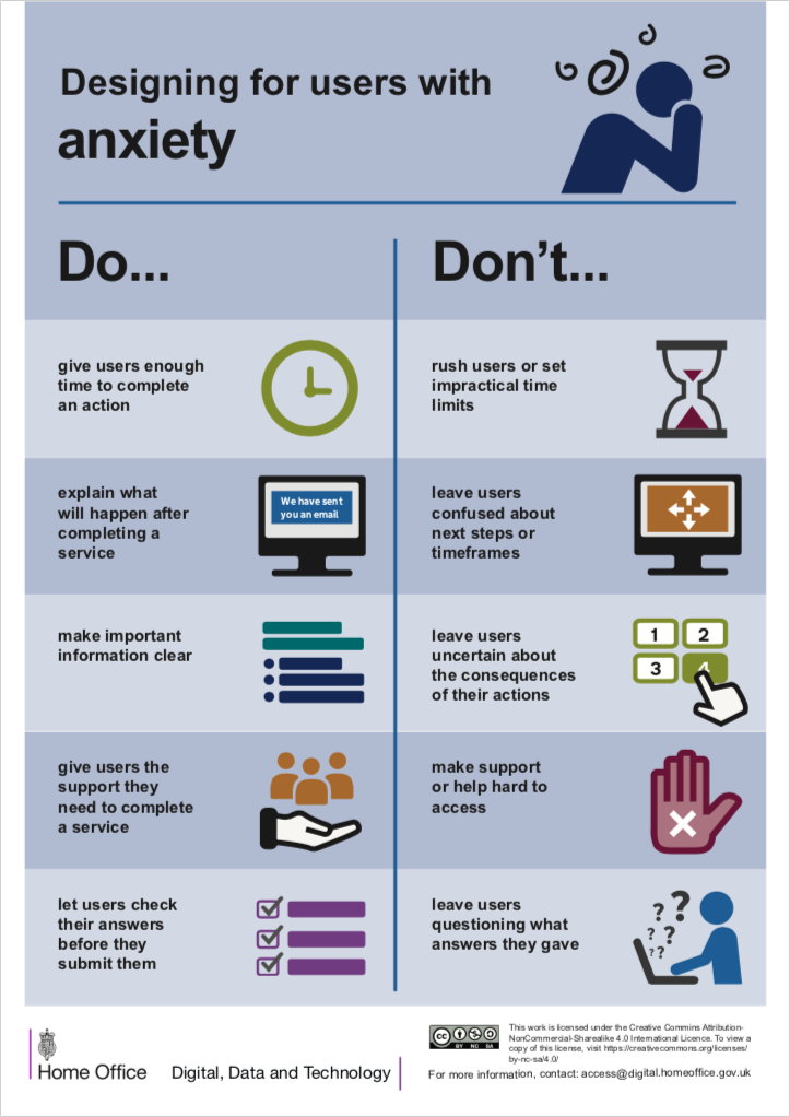
The UK Home Office Digital, Data and Technology team maintains a series of dos and don’ts posters that highlight research-driven inclusive-design best practices for different user groups. While the posters focus on accessible service design in government, much of their advice can be applied generally. A recent addition to the series is a poster on designing for users with anxiety (PDF, 1.0MB).
The following pointers can help address the concerns that were raised by people with anxiety and panic disorders:
Stop the clock

We might also take this advice a step further to actively create more peaceful user experiences. One respondent, who found chat room platforms frenetic and overbearing, praised a recent change to Skype that eschewed intrusive and demanding alerts in favor of more subtle notifications. They described how Skype “now has an icon that glows red with a new message, as opposed to making noises. I like this feature. It’s rather less nagging than the bwerps, flashing and cavorting that made it an irritating program to use in past.”
Manage expectations
In my previous post, respondents cited the unpredictable nature of certain websites and apps as another source of apprehension. This is particularly the case for online forms, where ambiguous labels and vague instructions can make anxious users rightly reluctant to trudge through the form. One respondent described feeling overwhelmed when there’s too much information or when something starts to feel too involved or complex. They added that this discomfort can be avoided by “simplifying forms, keeping them nice and clear, using easy to understand terms, and not having too much happening on the page.”
The Home Office poster offers advice along these lines, including recommendations to make important information clear, and explain what will happen after completing a form. It warns sites that they shouldn’t leave users “confused about next steps or timeframes” or “uncertain about the consequences of their actions”. A number of WCAG 2.1 success criteria, such as 3.3.2 Labels or Instructions and 1.3.5: Identify Input Purpose, encourage clarity in forms, while others, such as 3.2.3 Consistent Navigation and 3.2.4 Consistent Identification, promote a predictable and more familiar user experience. The inclusive design principle Be consistent also advocates for using well-established patterns and familiar conventions.
Remove (or apply) friction
Friction in UX design refers to anything that prevents users from accomplishing a task. The sense of powerlessness that websites and apps can provoke can often stem from unnecessary friction, such as making the option to cancel your subscription or deactivate your account just a little too hard to find. According to one respondent who finds speaking on the phone stressful, companies deliberately make it difficult to contact them through email because “it’s much harder to make an upsell when you have less opportunity to control the conversation.” They argue that companies should instead “make the customer comfortable however they wish to give you their money.”
Certainly, putting important information up front and making it easy for users to make contact in a way that suits them will avoid unnecessary anxiety. This is emphasized in the Home Office team’s advice to “give users the support they need to complete a service” and not to “make support or help hard to access”. The inclusive design principle Prioritise content also recommends prioritizing core tasks, features and information within the content and layout, while Give control encourages the notion that “people should be able to access and interact with content in their preferred way.”
Yet empowering users and giving control may be as much about applying friction as removing it. The Home Office poster also recommends letting users “check their answers before they submit them” so as not to “leave users questioning what answers they gave”. Similarly, the WCAG 2.1 success criteria 3.3.4: Error Prevention (Legal, Financial, Data) and 3.3.6 Error Prevention (All) require sites to let users review, confirm and correct their information before finalizing their submission. These recommendations introduce minor speed bumps to user journeys but ones that are arguably offset by the reassurance and comfort they provide to anxious users.

Keep it real

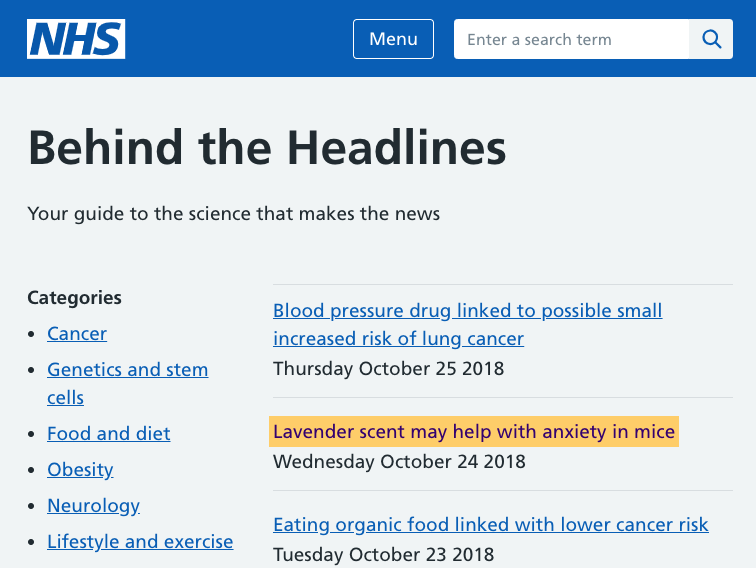
Delivering accurate and timely medical information without causing unnecessary panic and anxiety is a difficult balancing act. Although journalistic practices are beyond the scope of resources such as WCAG, there are numerous media guidelines that encourage balanced and responsible reporting of medical issues. For instance, HealthNewsReview.org provides tips and case studies for journalists writing about health care and complex medical topics. Similarly, the UK mental-health charity Mind provides a guide to reporting on mental-health issues that highlights the role of overly dramatic headlines and sensationalist terms in promoting fear and anxiety. And if you’re ever unsure whether a medical headline is true, NHS Choices: Behind the Headlines offers an unbiased evidence-based analysis of health stories that make the news.
Sadly, the perverse profit-making potential of clickbait headlines and sensationalist reporting means that they’re unlikely to go away soon. As developers and UI/UX designers, we need to be cognizant of dark patterns, and we need to do our best to avoid them. As users, there’s unfortunately not a lot that we can do—but we can vote with our wallets. There’s the old saying that ”if you’re not paying for it, you’re not the customer; you’re the product being sold” and that applies here too. So whether a site may be free or not free, if they make use of dark patterns with abandon, one may be able to send a message by not using that site anymore or by taking one’s business elsewhere.
Out of darkness
The advice in this post can help you avoid or reduce anxiety and panic triggers on the web. Helpfully, a team led by Sarah Drummond of design agency We Are Snook is also assembling a public-domain pattern library that aims to improve the design of online mental-health products and services. Essentially, it’s a set of evidence-based positive design practices that are designed to counteract the web’s dark patterns. These efforts will help make the web more usable for people with anxiety or panic disorders, and they’ll ultimately benefit everyone.
Note: Anxiety is a complex psychological condition. Treatment of clinically-diagnosed anxiety may take various forms, and we do not attempt to present these recommendations as a cure for anxiety. Rather, we offer them as a way to help you improve user experience by identifying and reducing unnecessarily anxiety-inducing situations.

Comments
Accessibility can be a minefield at times. The accommodation applied by Skype, that causes a new message alert to glow red rather than make a noise, could render this info inaccessible to blind users if not implemented correctly.
Sensationalist reporting is very common in America. It’s sad to see this becoming the norm in both TV and print.
Thank you for highlighting how WCAG 2.1 helps to address invisible illnesses. It’s a topic I hope will be is addressed more often.