Sometimes we do things with good intentions—but we end up missing the mark because of inherent biases, educated guesses, or just not having enough context. In those situations, we might end up unknowingly frustrating people. And this can be equally true in our work or in our everyday lives.
My wife and I have been married for going on seven years. And we’ve been close friends even longer. Although we’re usually very in sync, we can’t read each other’s minds. We try our best to consider each other in everything we do. But that doesn’t mean we’re perfect at it. Sometimes we’ll make assumptions about each other’s needs that turn out to be the opposite of what we actually needed. Like when I come back from Chick-fil-A with a breakfast biscuit for my wife only to catch them in the middle of cooking eggs because I didn’t tell them where I was going.
Why do I bring this up for a blog post about digital accessibility? Because it’s an example of how people express good intentions without knowing the whole story. My wife and I know each other pretty well, but we still make poor assumptions when we’re missing context. Website designers, developers, and content writers often think they have a great understanding of their users. But when they consider their users with disabilities, they rely too much on assumptions about people’s needs. As a result, website authors make assumptions about their users’ needs that leads to poor decisions and overengineered code.
Tell me something I don’t know
Alt text on images, hidden accessible names, and text hidden using CSS techniques are all meant to help people who can’t see. But an example of missing context that I commonly see is when people who write alternative text don’t realize what information screen readers already convey. For example, someone might be inclined to start composing an image’s alt text with “image of” without realizing that screen readers already announce that the content is attached to an image.

<img src="..." alt="Image of a duck swimming in a pond">
JAWS announces this markup as “Image of a duck swimming in a pond graphic.” (Because screen readers already know that that’s a graphic, they tell the user that.) So including that type of information in images’ text alternatives just adds to the noise that someone has to listen to.
One place that I see this all the time is with HTML <nav> elements and ARIA navigation landmarks. It’s common to assign accessible names to these type of landmarks so that screen reader users can tell them apart (and that’s a good thing). But screen readers announce this type of landmark with the “navigation” keyword—and it’s not uncommon to see authors include the word “navigation” in their accessible names. Someone who might not realize that screen readers will automatically append “navigation” to the end of navigation region announcements might think that naming a region with only “site” or “breadcrumb” might sound curt—and so I can understand how they might instead lean toward calling these “site navigation” or “breadcrumb navigation.” But what ends up happening is that that leads to repetitive screen reader announcements. That isn’t the worst thing in the world, but it can be pretty annoying for screen reader users. And it could add up to becoming a frustration if people encounter it frequently enough.
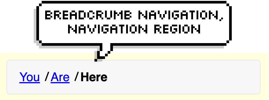
<nav aria-label="Breadcrumb navigation">...</nav>
JAWS announces this code snippet as “Breadcrumb navigation navigation region.”
Why the long label?
Consider this basic HTML button:
<button>Filters</button>
Screen readers will announce this as “Filters button” or similar. From that, someone can likely infer that the button activates some sort of interface for filtering information. Some suggest that it could be helpful to give a little extra context about what that interface will be, such as letting people know that the button triggers a modal dialog. There’s the aria-haspopup="dialog" attribute which, as of recently, has much better support across screen readers. That’s right Steve, this attribute isn’t total poop anymore! If you still don’t want to use this approach, what can you do instead? Well, I’ll tell you what you shouldn’t do:
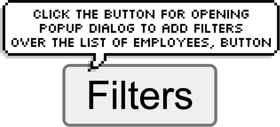
<button aria-label="Click the button for opening popup dialog to add filters over the list of employees">Filters</button>
Don’t laugh. Well okay, laugh. But maybe cry a little too. Because that’s an actual example that I’ve seen a developer use. It starts with good intentions: “I want to let people know that this button opens a dialog.” But it goes so far beyond being helpful that it starts to sound ridiculous. Whoever added that aria-label did so without putting themselves in their users’ shoes. Arguably, whoever added that aria-label didn’t consider that their users are every bit as smart and resourceful as they are. The creator of that label may have assumed that users might not be astute enough to know that a button is meant to be clicked—or this developer might have assumed that screen readers wouldn’t convey the button role to users. You’re probably way ahead of me here, but let’s look at the different parts of the aria-label to understand why this isn’t the best approach:
aria-label="click the..."– Telling screen reader users that they need to click something is unhelpful. While screen reader users will understand what you’re saying, referring to clicking on something doesn’t line up with how screen reader users interact with buttons. It’s reasonable to assume that all of your users understand what buttons are and that they know how to activate them.aria-label="...button..."– Like with the image and landmark examples, screen readers will already announce this role. Including the word “button” in a button’s label is redundant.aria-label="...to add filters over the list of employees"– I don’t even know what to make of this phrase. Maybe the author is trying to describe where the dialog will be positioned on screen? Either way, it’s verbose and unnecessary.
Depending on your point of view, this button might or might not fail any WCAG criteria. On one hand, the button has an accessible name, and that name ostensibly describes what the button does. And the name also contains the button’s visible label. Whether or not it fails, though—it’s just a bad idea. A better approach would be to just remove the aria-label attribute entirely. Or in a worst-case scenario, if there might be multiple filter-related buttons on the page, you could use aria-label or aria-describedby to give the context for what’s being filtered (in a more concise wording).
For instance:
<button aria-label="Filter employees">Filter</button>
Or:
<h2 id="employees">Employees</h2>
 <button aria-describedby="employees">Filter</button>
You can’t hide that from me!
Here’s the example that prompted me to write this entire article. I came across this while testing someone’s modal dialog widget with JAWS:
<div role="dialog" aria-modal="true" aria-labelledby="dialog-title">
<h2 id="dialog-title">Ticket details</h2>
<p class="sr-only">This dialog contains ticket details</p>
...
</div>
I realize that not everyone reads HTML every day, so let me elaborate on what the markup is doing. The “sr-only” class is a common naming convention for a CSS technique that lets you prevent text from displaying on screen while still making it available to assistive technologies like screen readers. This markup creates a dialog widget titled “Ticket details,” and the second piece of content inside the dialog is a paragraph reiterating that the dialog includes ticket details. That paragraph isn’t visible within the page: it’s only announced to people using screen reading software. But screen readers already announce that this widget is a dialog (because of role="dialog") and that the dialog’s name is “Ticket details,” so people using screen readers would have already known what type of information to expect in the dialog.
I’m left to assume that whoever wrote this code assumed that, for whatever reason, someone navigating with a screen reader wouldn’t understand what a ticket details dialog means. So they felt that they had to explicitly spell it out. I found this a little strange, so my first instinct was to take this code to my fellow TPGi-ers for a second opinion. My manager, Jeremiah, chimed in to comment, “This happens way more often than you might think on the web. It’s very insulting to me.” Jeremiah is a blind JAWS user, and so he has a better feel than I do for how prevalent things like this are. And it’s disheartening to hear that what I had found wasn’t a one-off case. In fact, shortly after writing my first draft of this article, I stumbled upon yet another example of this kind of thing:
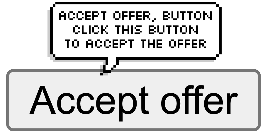
<button aria-describedby="button-description">Accept Offer</button>
<div class="sr-only" id="button-description">Click this button to accept the offer</div>
In this example, there’s a button that’s labeled “Accept Offer.” Someone then manually added visually-hidden text, and they even went the extra mile to make it the button’s accessible description to let only screen readers users know that they should click the button to accept the offer.
It’s no wonder that things like this happen often. At best, this example demonstrates a misunderstanding of your users. Or at worst, it could reveal an ableist bias against people with disabilities.
What do I do with this?
Good intentions are great. Empathizing with the community and wanting to be an advocate are the foundations of accessibility. But charging ahead without having a genuine understanding of how people interact with digital content can sometimes do more harm than good.
First and foremost, I think that it’s worth keeping in mind that people using screen readers are just as smart as anyone else. So please don’t talk to them like they aren’t. Don’t make the mistake in thinking that you need to hand-hold screen reader users when you write content. Talking down to users—whether unintentionally or otherwise—doesn’t help anyone. And that can end up coming across sounding more patronizing than helpful.
Secondly, I’d like to share a gut check that you can use to gauge whether you might be overthinking your content. Think about all the hidden and unhidden text across your site, be it through ARIA attributes, alt text, or CSS tricks. Now imagine the page stripped of its layout and with all of that text shown visually. Would you consider that content to be helpful? If the “This dialog contains ticket details” paragraph were displayed visually, do you think someone would look at that and go, “yeah, no kidding,”—or would that actually contribute meaningful information?
Thirdly, take a moment to pause and ask questions about what you’re building. Double-check your initial instincts to see whether your approach makes sense. Every decision that you make comes with a rationale. Make sure that you think through your reasoning, and ask yourself whether any biases might be sneaking in:
- “What made me think to add this extra information that’s only given to screen reader users?”
- “If I were to add hidden text or ARIA attributes, what value would they add to my audience?”
- “Am I creating redundancy in the information?”
Lastly, try to get a better understanding for how people interact with digital content. Don’t just skim through a page with a screen reader; learn how people actually use screen readers. To be fair, there can be some scenarios where more descriptive labels or visually hidden text can be helpful. But those are typically reserved for designs that rely on visual affordances that aren’t also conveyed through other content on the page. If you can, reach out to someone who uses a screen reader and get their opinion! More times than not, I’ve found that people like sharing their experiences. And if they can tell that you’re putting in the effort to consider their perspective and you really care about their user experience, they’ll appreciate you all the more for it.
<p class="sr-only">Thanks for reading!</p>
