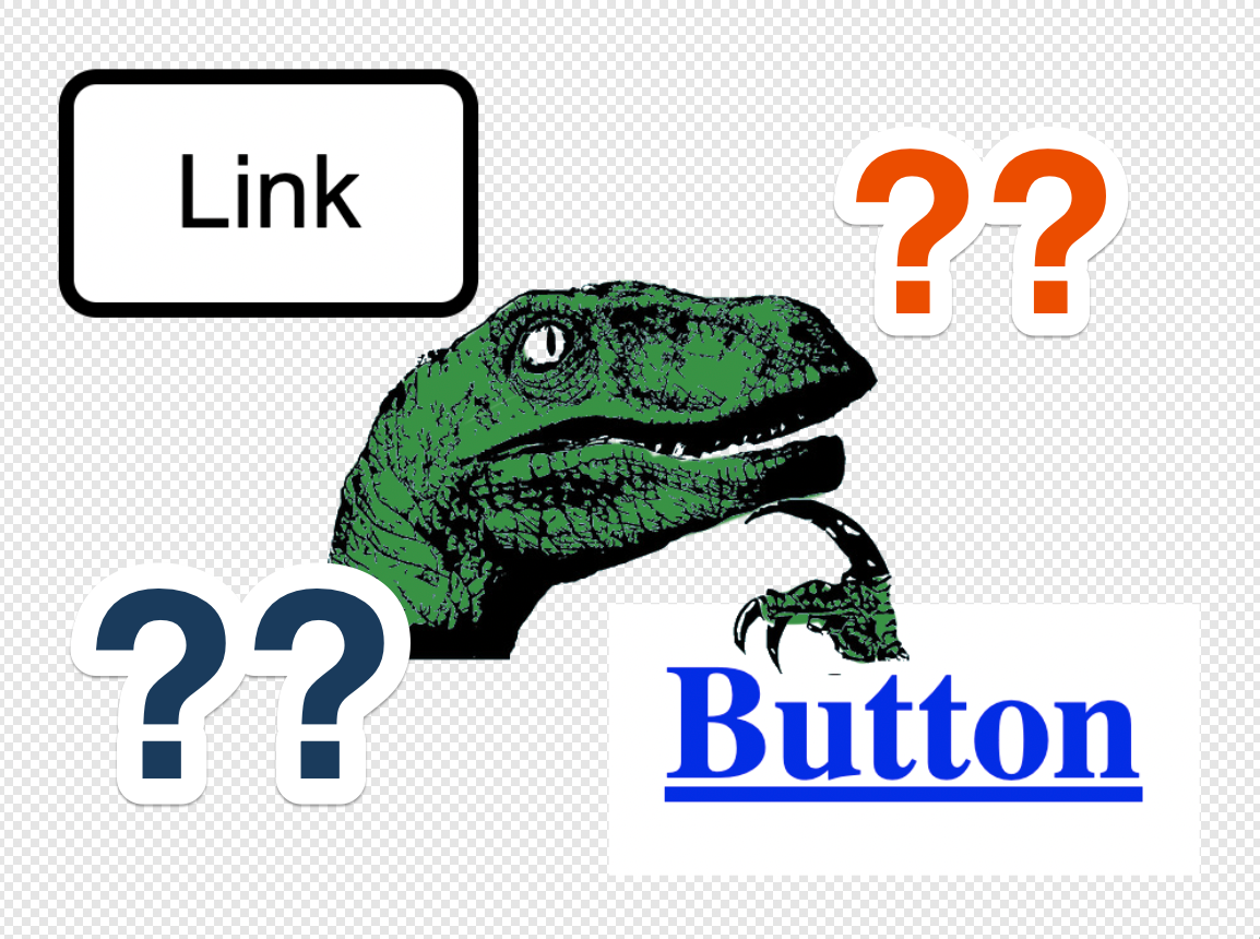
In my day-to-day role as an accessibility engineer, I see several issues that crop up regularly when auditing websites. There are the usual suspects: poor contrast, controls with no accessible name, keyboard issues, and the ever-present confusion that the site developers have over what a button or link should be used for. As I ask around, I have received mixed information about the severity of a button or link being identified correctly. But I think I have come to an understanding (after a conversation with Steve Faulkner, of course).
Button
WAI-ARIA defines a button as a widget that enables users to trigger an action or event, such as submitting a form, opening a dialog, canceling an action, or performing a delete operation.
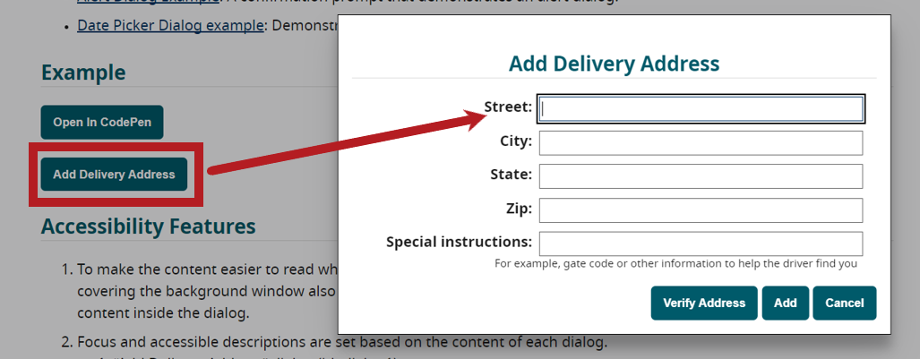
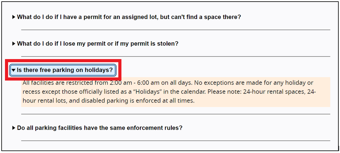
Some common examples of buttons are: disclosure buttons, toggle buttons, and buttons that open a modal dialog.
Link
A link provides an interactive reference that navigates to a resource, such as this one for the WAI-ARIA Link Pattern. The target resource might be a:
- Location on the same page (this includes internal links for Single Page Applications)
- Page elsewhere on the same site
- Page on another website
- Document that may be downloaded (such as a zip file or PDF)
Where the Lines Are Blurred
As I have mentioned above, some common buttons are disclosure buttons and buttons that expand dialogs, but do these buttons HAVE to be identified as a button?
If you look at the previously described definition of a link, an interactive reference that navigates to a resource. When selecting the control to open a dialog, the user is navigated to the dialog, which is located within the current page.

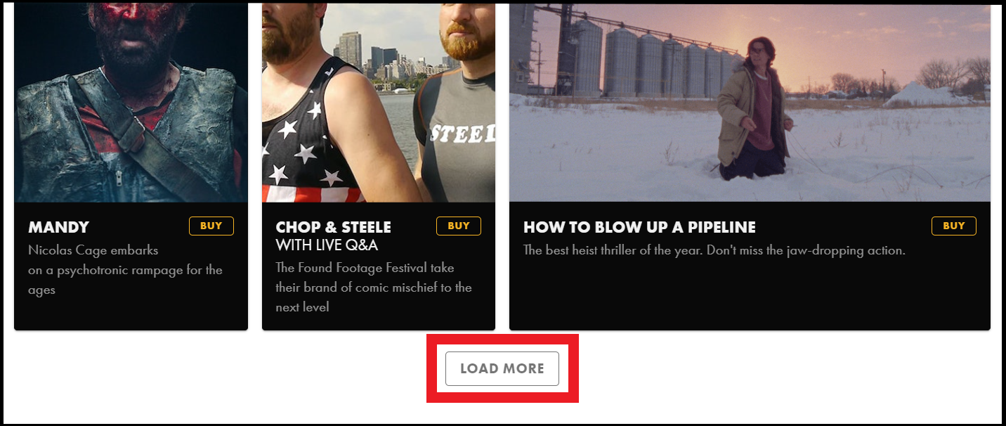
The same could apply to a disclosure button. If the disclosure button expands content that appears prior to the button itself (such as a “Show More” button), focus must move to the new content. If focus is moving to the new content, the user is being navigated to a resource.

This would not apply when the content that is revealed comes immediately after the disclosure button; focus would remain on the button and programmatically indicate the current expanded state.

What Does This Mean?
Should we identify these “buttons” that navigate the user to a resource as links? No. But if they are, it is not a WCAG failure, as they do indeed function the way a link is defined.
Also, while these controls do navigate the user to a resource, they also trigger an action (which is the functionality of a button). For example, expanding a dialog or expanding additional content.
This is when a best practice is used. Since it is expected that a button opens a dialog or a button is used for a disclosure control, it is best to stay consistent for the benefit of the user.
When to Fail a Button for Being a Link, or a Link for Being a Button?
- If a control navigates the user to an internal or external resource and it is identified as a button, that is arguably a failure of WCAG Success Criterion 4.1.2 Name, Role, Value.
- If a control only triggers an action and does not navigate the user to an internal or external resource, and is identified as a link, it arguably fails the same WCAG SC (4.1.2).
Summary
The goal is always to improve user experience. Screen reader users should not have to constantly guess how elements are going to function when they interact with them. Talking about the gray areas will make them much less gray and provide a more consistent experience when using various buttons and links.

