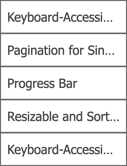
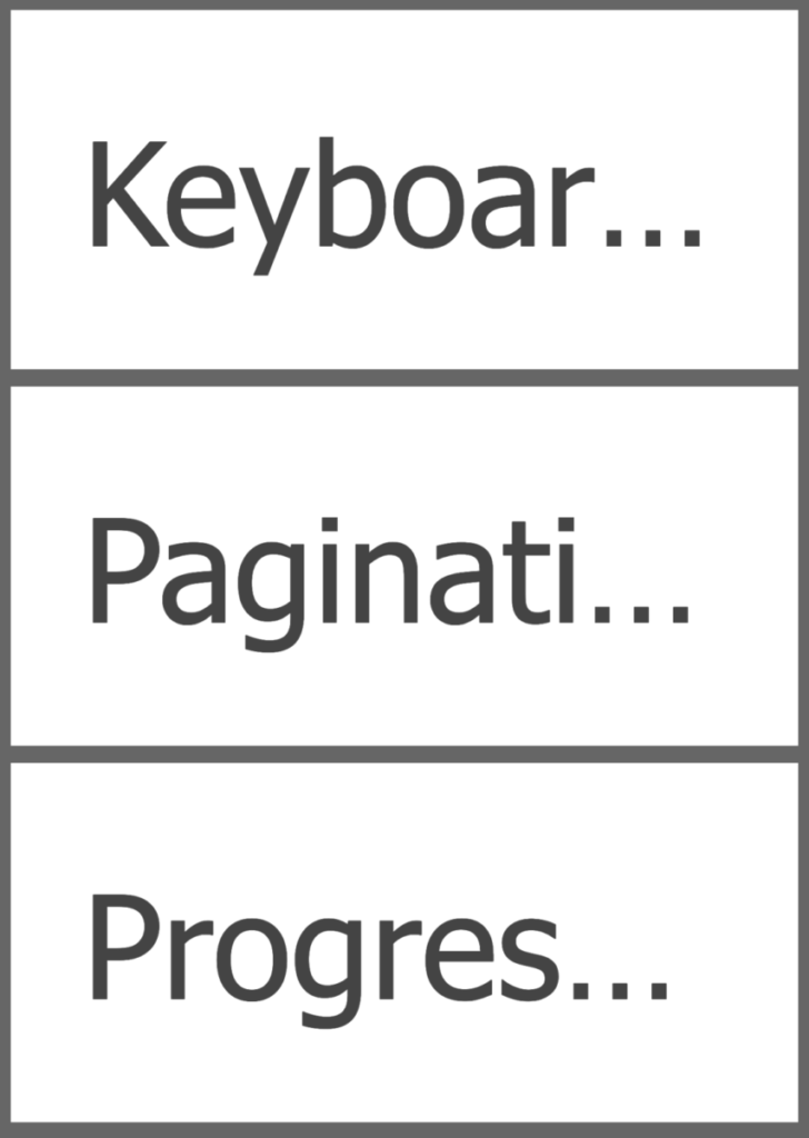
The CSS text-overflow property can be used to show a visual indication for text that’s been clipped by its container.
I’m not a fan, and take every suitable opportunity to discourage people from using this property; though I rarely get enthusiastic support on that point. So I was very pleased to see someone else flying the same flag.
A recent article by Eric Eggert is quite critical of this property, since using it in web content can cause it to fail Success Criterion 1.4.10 Reflow:
Content can be presented without loss of information or functionality, and without requiring scrolling in two dimensions for:
- Vertical scrolling content at a width equivalent to 320 CSS pixels;
- Horizontal scrolling content at a height equivalent to 256 CSS pixels.
Except for parts of the content which require two-dimensional layout for usage or meaning.
If text has been truncated with text-overflow, then this is a loss of content, and therefore an instant failure of 1.4.10.
Although the article concedes the possibility of valid use cases, I would personally go a step further and say there are none — that text-overflow should never be used.
How text overflow is used
The text-overflow property itself does not truncate text, it only specifies how the truncation should be indicated when it does occur. So it’s used in combination with other properties that restrict and clip the boundaries of a container, typically width or max-width combined with overflow: hidden.
Here’s an example of the syntax:
li {
    max-width: 35vw;
    overflow: hidden;
    text-overflow: ellipsis;
    white-space: nowrap;
}
And here’s an example of what that can look like when it takes effect:
The property value ellipsis is the most commonly used, and renders an ellipsis character (…) at the point of truncation, as you’d expect. This character (or whatever characters are specified) is included in the overall line-box limit, so the visual indicator itself further reduces the space available for the text, though only slightly.
The idea is that it can be used for containers with limited dimensions, so that single-line text within it doesn’t overlap the container in smaller viewports. It only works for single-line text, and can’t be used to truncate a multi-line paragraph.
However responsive layouts designed for small viewports also apply to larger viewports when viewed at high zoom (i.e. a 320px viewport at 100% zoom is functionally identical to a 1280px viewport at 400% zoom). So users who need large text to read effectively, such as people with low vision or a cognitive disability, may lose text content simply because of that need.
This is what makes it an accessibility issue, over and above the usability issue for small screen users.
Text truncated in this way might also fail Success Criterion 1.3.1 Info and Relationships. The truncation is purely a render effect — the full text is still in the DOM and accessibility tree — and no meta-data is exposed in the DOM to indicate where the break is. Arguably, this amounts to information or structure conveyed through presentation which cannot be programmatically determined. That would make it a 1.3.1 failure, but more importantly, it could be a problem for sighted screen reader users, when the spoken output no longer matches the visible text.
The potential for accessibility problems
Many CSS properties have the potential to cause accessibility problems, but that potential is rarely inherent to the property itself, it’s all about how you use it. Setting margin-left: -100vw on content that’s supposed to be visible will render it off-screen, which is an accessibility problem; but that doesn’t mean that margin itself is a problem.
Using overflow: hidden is a better comparison, because it has high potential for causing loss of text content. There are valid use-cases for it, but these are cases where either the loss of text content is intentional (i.e. for visually-hidden text), or where there’s no possibility of text content being lost (e.g. the element doesn’t have any text, or very little).
However text-overflow is inherently inaccessible, because its only purpose is to wave-through inaccessible design. In my view, this property should never have made it to the specification, it should have been rejected at the proposal stage.
Whenever overflow: hidden is used, it has to be carefully tested in various viewports and view sizes, to ensure there’s no possibility of text content being lost. But with text-overflow that testing is irrelevant, since the property only applies when text content has already been lost. If text-overflow kicks in, the design has already failed.
I think there are no valid use-cases for text-overflow unless the same text content is available elsewhere on the page; but if the content is available elsewhere, why is it duplicated here? If the intention is to create a short summary of longer content, then just write a short summary; it would read better anyway.
Wherefore art thou?
Ever-focused on solutions, I spent some time investigating whether content lost to text-overflow could be exposed in another way. But that doesn’t seem to be possible, at least not in any useful way.
Using a tooltip isn’t accessible, because title attributes are not available to keyboard or touch users. It is possible to make custom tooltips that support both keyboard and touch, but only for elements that are non-actionable, and are also in the Tab order. They have to be focusable to support keyboard users, but they also have to be non-actionable for touch users, since tapping the element would otherwise trigger its action. Having focusable elements which are not actionable is a source of potential confusion for keyboard and assistive technology users, because they seem like they should be actionable but just don’t work. And touch users are not likely to discover this functionality anyway; tooltips just aren’t a thing in touch interfaces.
Tooltips are not the answer.
Using aria-label is not the answer either, because it’s not visible, and therefore not available to most users who are not using assistive technology.
So then I wondered whether a scripted solution could create some kind of disclosure element, like, the ellipsis at the end being clickable and revealing the additional text. But how would it be revealed? We’ve already seen how a tooltip is not a viable solution, so it would have to be revealed by expanding the text inline.
That could work; it’s not exactly elegant or discoverable, but it could work.
But hang on … if there’s space to show the extra text inline, then why is it truncated in the first place? Using text truncation is not a positive design choice, it’s an emergency band-aid for designs that can’t properly handle overflowing content. Why would anyone want to make a feature out of that, it contradicts itself.
There’s no angle here. You can’t put lipstick on a pig.
(Sorry pigs, you’re awesome and beautiful, but this is the most recognizable expression I could think of to make this point!)
Alternatives to text truncation
The real answer here is not to rely on text truncation at all.
Designs should be flexible enough to accommodate any content they might have, in any viewport size (from 320px), and any increases in zoom (up to 400%).
This is not as challenging as it might sound.
Ten years ago, with floats or flexbox, it was much more difficult. But modern CSS techniques, such as responsive grids, make it relatively easy to build highly adaptive layouts that can accommodate significant changes in content size, while still maintaining a tidy layout. This concept is sometimes referred to as “asymmetrical design”, i.e. design which embraces the fact that data is not neat or symmetrical, rather than trying to force it to be (like Apple do, cough).
Even with a fully responsive and flexible layout, there may still be cases where text overflow could occur, for example, where a container is relatively small by default but may also contain very long words. There are other, much more elegant and accessible techniques for handling these situations, for example:
- The CSS
word-breakproperty can be used to control hard line-breaking, e.g. that long words should be split without hyphenation wherever this is necessary to avoid container overflow. - The soft-hyphen character (poetically named
­in HTML) can be used to specify hyphenation points in long words, and don’t visibly render unless hyphenation is necessary. This is often used in combination with the CSShyphensproperty, which can alternatively be used to let the browser calculate hyphenation points automatically.
Soft hyphens is the better solution, I think, at least for English-language content, because it’s easier to comprehend. I would use word breaking for technical content such as code, where dashes may appear as content and could be confused with hyphens.
But whatever solution you choose, remember that …
Resources
text-overflow(MDN)- Text-overflow: ellipsis considered harmful
- Success Criterion 1.4.10 Reflow
- Success Criterion 1.3.1 Info and Relationships
- Look Ma, No Media Queries! Responsive Layouts Using CSS Grid
- Embracing Asymmetrical Design
word-break(MDN)hyphens(MDN)- Techniques to Break Words


Comments
I’d be careful using soft hyphens. Due to an NVDA bug, poorly-placed soft hyphens may cause mispronunciation issues. Unless you hyphenate compound words (“racecar” becomes “race-car”), you should double-check the pronunciation of hyphenated words in NVDA.
More info:
– NVDA bug: https://github.com/nvaccess/nvda/issues/9343
– My recommendations for word overflow and hyphenation: https://seirdy.one/posts/2020/11/23/website-best-practices/#wide-items
Thanks for your comments. So automated hyphenation is best avoided, and soft hyphen points need to be carefully chosen. That sounds like good advice.
Very illuminating James and the end was funny, thank yo…