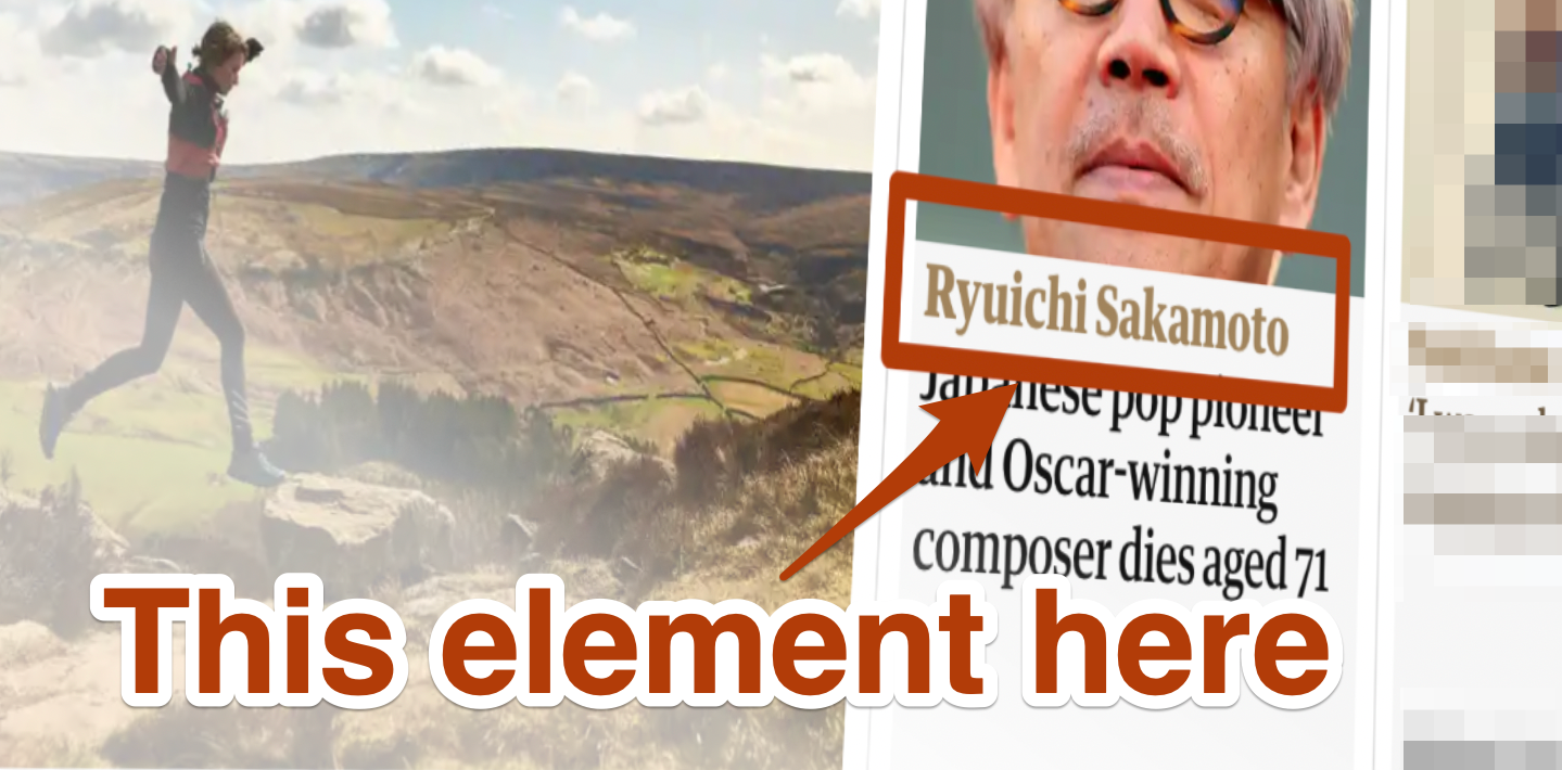
If you’re in the business of logging faults—whether that is in the field of accessibility (as I assume most of the readers of this blog will be) or any other industry where you may need to report bugs of some kind in apps or websites—you will probably have been asked to include screenshots at some point. But what is the best way to handle screenshots? This is precisely the question that was posed by a colleague just recently relating to one of our clients and it prompted me to do the proverbial brain dump. In this article, I cover some of the techniques that I use which have served me well over the years. Some of it is specific to logging accessibility issues, but the bulk of this applies to any type of fault logging.
 What this article is not: a deep dive into the various screenshot applications that you might choose. For what it’s worth, my favourite screenshot app is an old macOS one, Skitch, which is no longer maintained but I just can’t seem to let it go. Anything that lets you grab a screenshot, annotate, highlight and then quickly get out of your way is good, really.
They say that a picture is worth a thousand words. Sometimes, our descriptions of issues can easily run on to be very long (and usually necessarily so, due to the complexities involved!). But when it comes to describing where an issue occurs and how/why it’s wrong, some people will find it MUCH easier to grasp with a screenshot.
Depending on the bug tracker that you use, you might need to indicate the location of the affected element(s) using XPATH or similar (CSS selector, perhaps). However, bear in mind the XPATH/CSS reference that you set at the point of logging it might well be completely wrong by the time the developer who has to fix the fault gets to it (as the document structure may have changed); it may not accurately pinpoint the issue. Of course, it may not even be a web page/app that you’re logging a fault with and you may have no easy programmatic way of referencing the affected element.
A well-worded description of the affected element(s) in your remediation notes, supported by a clearly-annotated screenshot of the affected element(s) should ensure the fault is easily understood, regardless of platform/OS, and is more likely to be fixed correctly.
But what makes a good screenshot? Here are some pointers for what can make a difference.
Crop to Include Only What’s Needed
If you have a browser running full screen at 1280×1024 and the affected area is just a small portion of that screen, taking a screenshot of the whole page may not be terribly useful. A thumbnail view of the image (which will be most people’s view of it at the receiving end) won’t be as clear about what the problem is, and opening full size might yet make them have to hunt around.
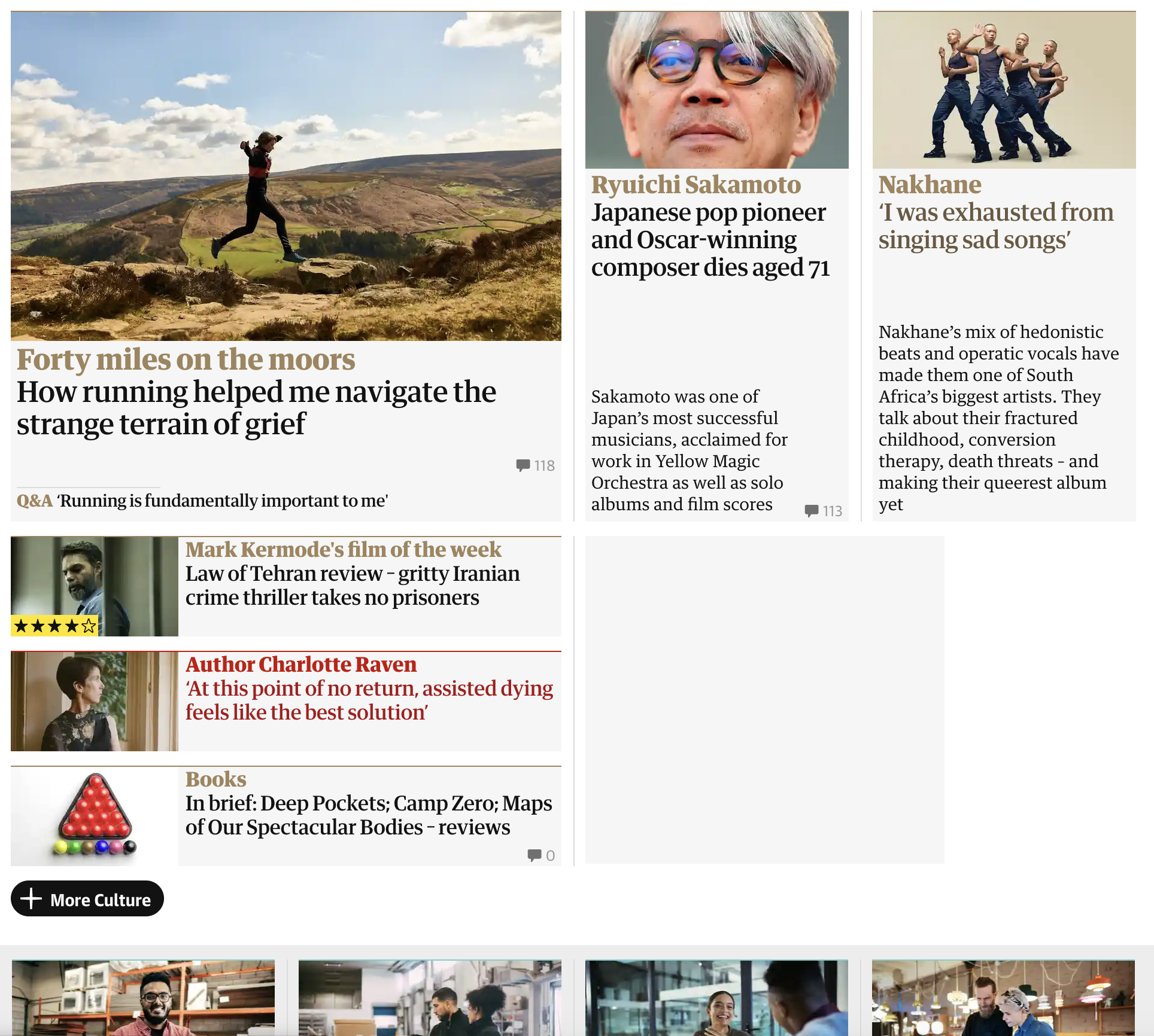
Crop the image so the affected area is clear at a glance.

But Don’t Crop Where Context is Everything
Conversely, there will be situations where cropping will NOT be as useful. For example, a page that has multiple instances of very similar elements. If only one section has the issue and you crop too tightly, that might be confusing. Use your judgement. If in doubt, you can take a screenshot that shows the whole page with the affected area highlighted and then a second screenshot that is closely cropped and provides more detail or annotations, perhaps. This leads nicely to the next two points…
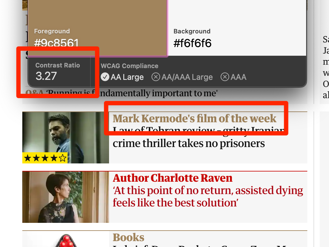
Highlight Affected Areas With Boxes
Indicate the affected area(s) with a box or something else that clearly indicates where the problem lies.
Annotate in the Screenshot
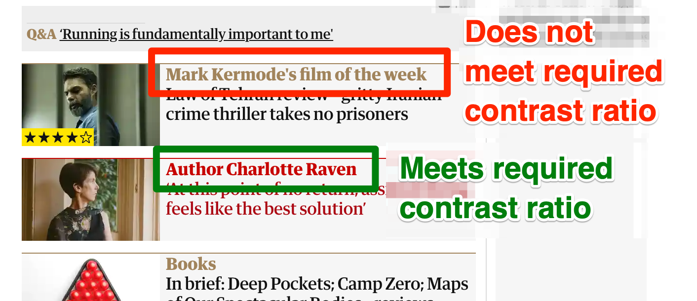
An image that has an affected element highlighted with a box makes sense when it is viewed alongside text description. But it is even better if the screenshot alone can tell the story. If you can, annotate the screenshot too, with a brief description of the problem (“Text is truncated at 400% zoom”, “Button has low contrast” and so on).
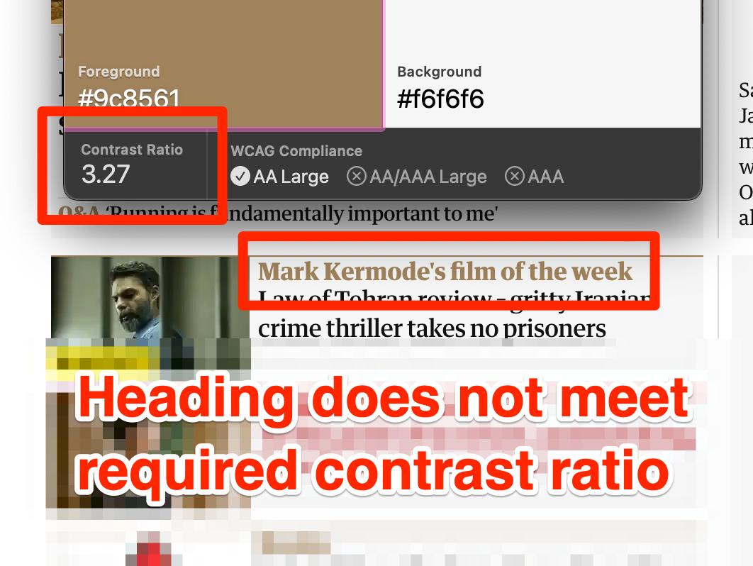
Use Color to Help Indicate Good and Bad Areas
Using color to indicate an area that has issues by boxing it in red, and using red text, then using green text on advisory text can help some people to grasp the rights and wrongs more quickly. But of course, as we all know (or should know), use of color alone is not good. However, the wording used in the annotation should mean that those who cannot perceive a color difference will not be adversely affected.
Make sure that use of those colors (with the box or the text) does not result in a color contrast issue, too. If your screenshot tool has text that has a thick stroke around the text (as Skitch does), this can help when adding text over a background that may have multiple colors.
You might also note that I have blurred the background behind the text, too, to make the unimportant background sections less distracting. This is another reason I like Skitch: the pixelation tool is so quick and easy to use.
Indicate the Affected Area in DevTools
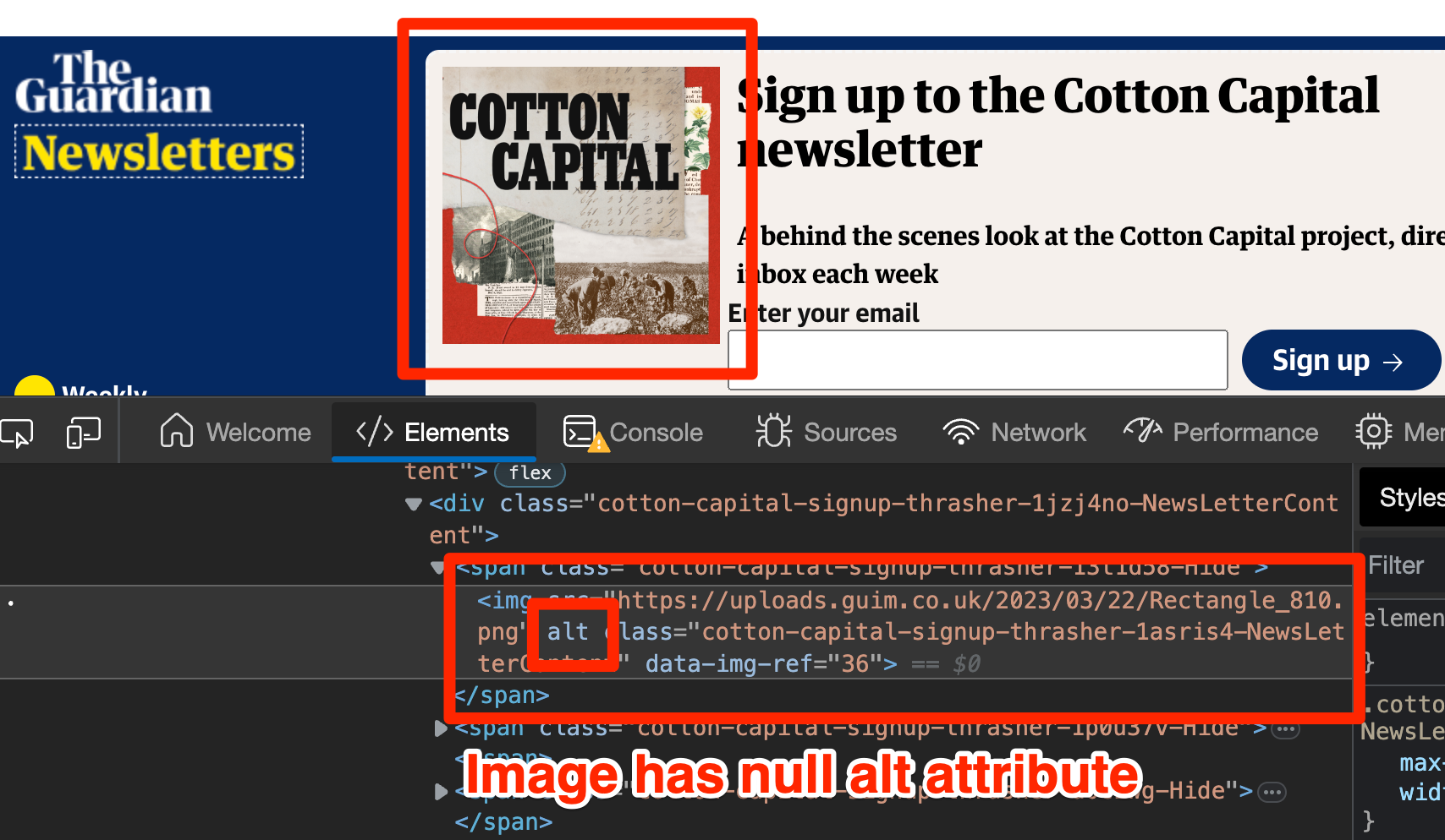
It’s one thing to indicate a visible issue in the app/site UI, but sometimes the issue does not render anything obvious in the UI. Instead, the issue is in the markup somewhere—such as inappropriate ARIA attributes, missing attributes or incorrect HTML elements—but indicating the markup problem alone is not always hugely helpful. Ideally, the screen should be arranged such that the visible element is in view, and the related element is showing in the DevTools elements tab (maybe boost the font size in the DevTools for clarity), and then highlight both items. This will make it very clear to the person addressing the bug where the fault is and why.
Use as Many Screenshots as You Need, Number Them to Indicate Sequence
You don’t have to limit yourself to just the one screenshot. Sometimes you need to go through a few steps to show the issue and maybe those steps are difficult to explain. The steps to get there may also benefit from screenshots. Take as many as you need, number them sequentially. If you have the tools, you might want to merge them as a collage.
Record Video. Narrate if You Can
Screenshots are great. Videos are even greater. A narrated video of the issue while you explain the issue is chef’s kiss perfection. Not only will this help the client, but it will also likely help you, too, if you come back to the issue months later and you have a perfectly clear demonstration of what the problem was at the time.
Use Recorded Video to Capture Fleeting Moments
Experiencing an issue that is fleeting? Something that happens so quickly that it’s impossible to check something in DevTools or note down what a screen reader announced? Record the interaction on screen (see previous point), play it back at the moment where the issue occurred, then screenshot that frame and annotate accordingly.
Save the File So That it’s Self-descriptive
You don’t need to save images with short, meaningless filenames. Most characters can be entered into filenames without complaint (apart from ‘/’ character), so name your files in a way that clearly explains the issue. If you annotated the screenshot, it’s likely that your annotation will make a good filename:
- Text is truncated at 400% zoom.png
- Apply button has low contrast.png

Yes, you can have filenames with spaces (you might prefer to batch rename files to swap all spaces to hyphens at a later date, if that makes you more comfortable).
Prefix the Filename With the SC It Relates To
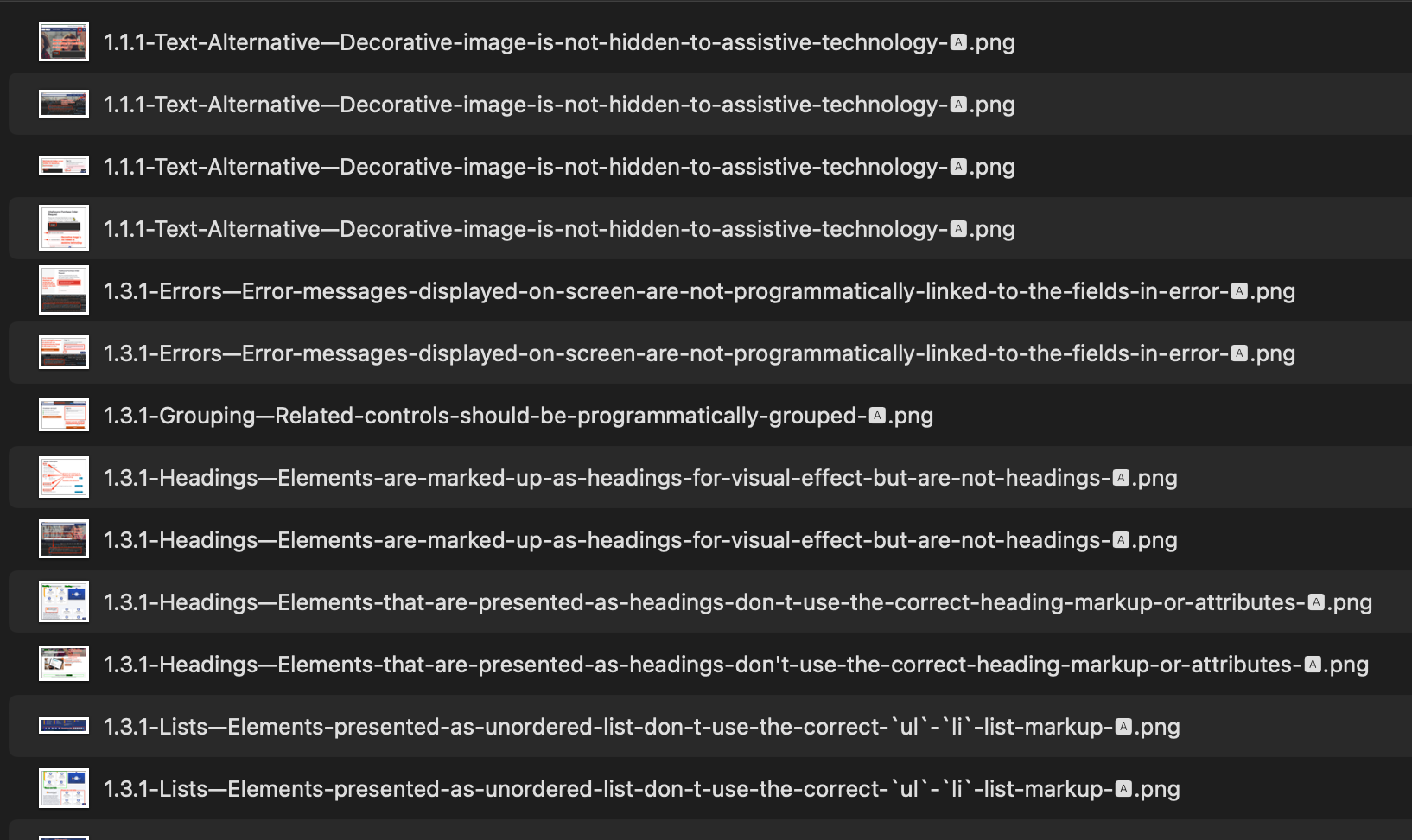
If you store all your screenshots for a given component that you are auditing in the same folder, it’s handy to prefix them with the Success Criteria they relate to.
- 1.4.10 Text is truncated at 400% zoom.png
- 1.4.3 Apply button has low contrast.png
This will help you sort and group issues in Windows Explorer or Finder to get a quick overview of the issues that you logged, as the image below shows:
What to Do About alt Attributes?
Depending on where your screenshots are presented/consumed, you may not be in a position to enter alt text. However, if you follow the advice to name the file so it’s self-descriptive, you probably have it covered automatically:
- If your bug tracker that shows these images does not add an
altat all, a screen reader user will have your filename as a fallback. And because you wrote it well, it will work great in this scenario!
- If the bug tracker sets an empty
alt, you’ve still got it covered because you treated the screenshot as an enhancement to the description you provided in remediation notes. If you were relying on that image to convey key information, you’re doing it wrong.
In Summary
Screenshots are great and often help those who can see them understand issues much more quickly than deciphering your very descriptive fault diagnosis and remediation notes. Think of them as enhancements, not replacements, for well-written fault logging. But if you can include screenshots, you may as well make them the best they can be.
